Purpose
Container for a multiple selection control, for example a group of checkboxes.
Contained by
Contains
Attribute groups
Attributes
| Attribute | Description | Type | Default | Options | Use |
|---|---|---|---|---|---|
| errmsg | The error message to be issued if the control fails validation | xs:string | none | optional | |
| initial | The initial value of the control | xs:string | none | optional | |
| name | The name of the control and the form variable return to the server | xs:string | none | required |
Example
You use the mcs-selection-list-style style property to control visual appearance of the selection controls. For instance, if mcs-selection-list-style is set to 'controls', then the list will be displayed as checkboxes.
The mcs-selection-list-option-layout property controls the order of the captions and controls in the display if both occupy the same pane. The possible values are: 'caption-first' and 'control-first'.
For the sake of clarity the style properties are specified using the style attribute. However, it is a good practice to use themes to control styling.
<?xml version="1.0" encoding="UTF-8"?>
<canvas layoutName="/forms.mlyt" pageTitle="xfmuselect">
<xfform name="formControls" action="download.jsp">
<xfmuselect name="select" caption="Choose platform" captionPane="controlCaption1"
entryPane="controlEntry1" initial="linux"
style="mcs-selection-list-style: controls;
mcs-selection-list-option-layout: control-first">
<xfoption caption="Windows" value="windows"/>
<xfoption caption="MacOS X" value="mac"/>
<xfoption caption="Linux" value="linux"/>
</xfmuselect>
<xfaction type="submit" caption="Download" captionPane="controlCaption2"
entryPane="controlEntry2"/>
<xfaction type="reset" caption="Reset" captionPane="controlCaption2"
entryPane="controlEntry2"/>
</xfform>
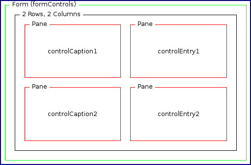
</canvas>The forms.mlyt layout may have the following structure.