Purpose
Defines a text input control that can represent a single line or multiple-line text entry.
Contained by
Attribute groups
Attributes
| Attribute | Description | Type | Default | Options | Use |
|---|---|---|---|---|---|
| errmsg | The error message to be issued if the control fails validation | xs:string | none | optional | |
| initial | The initial value of the control | xs:string | none | optional | |
| inputMode | Sets the default character input mode for iMode and MML devices | xs:string | none | katakana, hiragana, latin, latin digits | optional |
| maxLength | The maximum number of characters in the content | xs:string | none | optional | |
| name | The name of the control and the form variable return to the server | xs:string | none | required | |
| type | The type of text input control | xs:string | text | text, password | optional |
| validate | Rules for validating the content | xs:string | text | optional |
Examples
<?xml version="1.0" encoding="UTF-8"?>
<canvas layoutName="/forms.mlyt" pageTitle="xftextinput">
<xfform name="formControls" action="download.jsp">
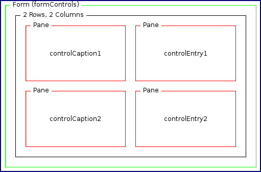
<xftextinput name="login" caption="Login" captionPane="controlCaption1"
entryPane="controlEntry1"/>
<xftextinput name="password" caption="Password" type="password"
captionPane="controlCaption2" entryPane="controlEntry2"/>
</xfform>
</canvas>The mcs-rows and mcs-columns properties define the size of the textarea. For the sake of clarity the style properties are specified using the style attribute. However, it is a good practice to use themes to control styling.
<?xml version="1.0" encoding="UTF-8"?>
<canvas xmlns="http://www.volantis.com/xmlns/marlin-cdm" layoutName="/forms.mlyt"
  pageTitle="xftextinput">
  <xfform name="formControls" action="download.jsp">
    <xftextinput name="message" caption="Message" captionPane="controlCaption1"
      entryPane="controlEntry1" style="mcs-rows: 2; mcs-columns: 20"/>
  </xfform>
</canvas>
The forms.mlyt layout may have the following structure.