DB2 Query Patroller Administration Guide
This chapter describes how to start and stop Tracker and how to use Tracker to
display job history data.
Complete the following steps to start the Tracker application:
- From the Start menu, select Programs >
DB2 > DB2 Query Patroller > Tracker.
The Login to Tracker window opens.
- Type your user ID, password, and database alias, and click
OK. A list of reports display.
| Note: | The user ID and password are case-sensitive.
|
- Select a report, and click OK.
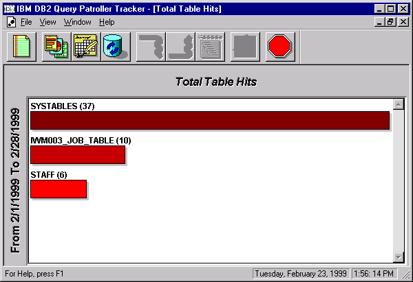
The report displays using the default date range and the default report
format as illustrated below. For information on changing the date
range, see Changing the Date and Time Range. For information on changing the report format, see Report Formats.

| Note: | Even though the hours do not display in the date range at the left side of
this and other reports, the hours can be specified and are used to determine
the date range for the information in the report.
|
Tracker allows you to view job history data so that you can tune the database
for heavily used tables and columns. For a description of each report
available in Tracker see Tracker Reports.
Tracker allows you to display reports in up to six child windows, a feature
that allows you to compare data among reports. You can set the date and
time range and you can also change the way the data displays for most
reports. For example, the Total Table Hits report, its drill-down
reports, and the Rows Returned by Table report allow you to view information
in a list (as a count or as a percentage), in a bar chart (as a count or as a
percentage), or in a pie chart (as a percentage only). The Job Activity
over Time report allows you to view jobs completed in a time-chart
format.
Complete the following steps to display a report:
- Click New Report to display a list of available reports.
- Select a report and click OK to display data for the defined
date range. See Tracker Reports for more information about the reports.
A default date range exists for an entire Tracker session, which means that
each new report opened during that session uses the default date range.
While the date range can be changed for a particular window, the default date
range cannot be changed within a session. Therefore, if you change the
date range for a report, it neither resets the date range for the next report
you open within the session nor does it necessarily reset the default date
range for the next session. Changing the date range for the last report
opened in a session is the only way to reset the default date range for the
next session.
When you open a report, the data displays for the default date
range. You can change the date range for the current window (which may
change the data displayed in the report). You can set different date
ranges for each window to view reports for different time periods.
| Note: | Even though the hours do not display in the date range at the left side of
each report, the hours can be specified and are used to determine the date
range for the information in the report.
|
In addition, if you change the date range in a Job Activity over Time
report, the scale of the displayed data may also change. For example,
if the date range is less than 30 days, the increments displayed in the Job
Activity over Time report are days, as illustrated below. See the
procedure at the end of this section and also see "Zooming and Panning on a
Time Chart" later in this chapter for information on how to change the date
range for a Job Activity over Time report.
If the date range is greater than a year, the increments displayed in the
Job Activity over Time report are years. If the date range is 24 hours
or less, the increments displayed in the Job Activity over Time report are
hours.
Complete the following steps to change the date range for a specific
window:
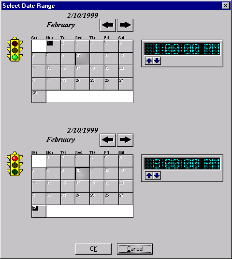
- Click the Set Date Range push button. The Set Date Range
window opens, as illustrated below. This dialog box contains two
calendars and two 12-hour clocks so that you can set the start and end dates
and times.

- Define the start date and time by completing the following steps:
- Use the push buttons with the arrow icons to change the month of the Start
calendar.
- Click a day in the start calendar to select the start date.
- Click the up or down push button to change the time (by hour) on the Start
calendar.
- Define the end date and time in the same way using the End
calendar.
- Accept the date range by clicking OK.
Complete the following steps to refresh the data for a report:
- Select a window to make it active.
- Click the Refresh Data push button to update the data in the
window.
| Note: | For new data to be available to display, iwm_tracker (the back-end process
for Tracker) must have been run to analyze any job accounting data that
accrued since its last run.
|
The Total Table Hits report and the Rows Returned by Table report allow you to
view data as bar charts (as a count or as a percentage), lists (as a count or
as a percentage), or pie charts (as a percentage only).
Bar charts display data as a count or as a percentage. The horizontal
bars are arranged vertically, from largest to smallest. An example of a
bar chart is illustrated. Alternatively, you can choose to view a bar
chart with percentage information.
Lists display data as a count or as a percentage. The element with the
highest value is at the top of the list. The same list can be viewed
with count information.
Pie charts show percentage data only. Each slice of the pie represents
the percentage an element was accessed relative to the total accesses for all
elements. Each wedge of the pie chart is also listed in a legend that
lists the percentage value for each slice.
Complete the following steps to change the default report format, which sets
the format for the current report and subsequent reports, including the next
time you run Tracker:
- Select a window to make it active or open a new report.
- Click the Change Report Format push button.
The Change Report Format window opens.
- Select a format, and click OK.
You can drill down to more detailed information if a drill-down report has
been defined. See Tracker Reports for information on the reports available for drill
down.
Complete the following steps to drill down to more specific data:
- Select a window to make it active or open a new report.
- Select an element from the report: a bar, a line in a list, or a bar
in the pie chart legend. If a drill-down report is available, the
Drill Down push button becomes active.
- Click the Drill Down push button.
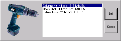
If only one drill-down report exists at the next level, the new report
displays in the current window. Otherwise, if you can drill down to
more than one type of report, a list displays as illustrated below:

- Select the report that you want to view and click Drill.
The new report displays in the current window. The report uses the
date range of the parent report and the current report format.
If you have drilled down, you can drill back up through the same path.
To drill back up through the reports, complete the following steps:
- Select a window to make it active.
If a higher level of reports exists, the Drill Up push button
becomes active.
- Click the Drill Up push button to display the report from one
level up. The report displays in the current window using the current
report format and the date range established for this window.
You can view the drill path you followed for the active window.
Complete the following steps to display the drill path:
- Select a window to make it active.
If a drill path is available, the Drill Path push button becomes
active.
- Click the Drill Path push button to display the drill path for
the active window.
The Drill-Down Path Display window opens. The currently displayed
report is listed at the bottom of the drill path.
- Click OK to close the Drill-Down Path Display window.
Use the Pan push button or the Zoom +/-
push button to toggle between pan and zoom modes. The active push
button displays the mode to be selected, not the current mode.
Complete the following steps to zoom and pan on a pie chart:
- Select a window to make it active or to open a new report.
- If the format is not a pie chart, change the format to a pie chart.
- In zoom mode, place the cursor over the area that you want to zoom in on
and click.
The pie chart displays enlarged, with the click point at the center of the
display.
- After you zoom in on an image, you can switch to pan mode by clicking the
Pan push button.
- In pan mode, place the cursor over the area that you want to be the center
of the screen and click.
The area over which you placed the cursor becomes the center of the
screen.
- Click the Zoom push button to switch to zoom mode.
- To zoom out, right-click.
The entire pie chart displays at the normal size
Complete the following steps to zoom and pan on a time chart:
- Select a Job Activity over Time window to make it active or open a new Job
Activity over Time report.
- In zoom mode, place the cursor over the column dividers just below the
scale legend on the report; the zoom cursor becomes visible.
- Click to zoom in.
Zooming in increases the scale and decreases the number of days displayed
in the report. For example, if the current scale displays data for 30
days, and you zoom in, the number of days displayed decreases to approximately
18 days.
- After you zoom in on an image, you can switch to pan mode by clicking the
Pan push button.
- In pan mode, place the cursor over the time segment that you want to be
the center of the screen and click.
The time segment over which you placed the cursor becomes the center of the
screen and the date range is updated to reflect the change.
- Click the Zoom push button to switch to zoom mode.
- To zoom out, right-click.
Zooming out decreases the scale and increases the number of days displayed
in the report.
To close a report window, complete the following steps:
- Select the window you want to close to make it active.
- From the File menu, select Close.
To exit Tracker, click the Exit Tracker push button. The
push button is displayed below:

[ Top of Page | Previous Page | Next Page | Table of Contents | Index ]
[ DB2 List of Books |
Search the DB2 Books ]
