Gradients allow page authors to create objects that consist of smooth fades between several colors, so-called "rainbow effects". There are two types of gradients: linear and radial.
Gradients allow page authors to create objects that consist of smooth fades between several colors, so-called "rainbow effects". There are two types of gradients: linear and radial.
Linear gradients are defined by a start point, an end point, and a set of colors. The color values are interpolated along the line determined by the start and end points. Radial gradients are defined by an inner circle, an outer circle, and a set of colors. Each circle is specified by a center and a radius. The color values are interpolated from the circumference of the inner circle outward to the circumference of the outer circle.
Configuring gradients
The mcs-gradient() function is used to control gradients. It can be used with the background-image, list-style-image, mcs-border-image-source and mcs-box-reflect-alpha-mask properties.
A linear gradient has the following syntax:
mcs-gradient(
  linear,
  <start-point>,
  <end-point>,
  <color-stop>,
  <color-stop>[, <color-stop>]*)
A radial gradient has the following syntax:
mcs-gradient(
  radial,
  <inner-origin>,
  <inner-radius>,
  <outer-origin>,
  <outer-radius>,
  <color-stop>,
  <color-stop>[, <color-stop>]*)
Where:
- linear, radial
-
The keywords defining the type of gradient.
- <start-point>, <end-point>, <inner-origin>, <outer-origin>
-
Define positions relative to the containing box. These properties use the same syntax as the theme_background_prop.html#background-position property. Please note that length values must be specified in pixels.
- <inner-radius>, <outer-radius>
-
Define length values that specify the radius of the associated circle. Both values must be specified in pixels.
- <color-stop>
-
A function that defines a color stop. It can be used to specify multiple in-between color values, and the browser rendering the page will interpolate the color values between them. The function has the following syntax:
mcs-color-stop(<color>[, <percentage>])The optional <percentage> parameter specifies the distance from the start point to the end point of the gradient. If it is not provided, then it is determined in the following way:
-
If the first color stop does not have a position, its position defaults to '0%'.
-
If the last color stop does not have a position, its position defaults to '100%'.
-
If any other color stop does not have a position, then color stops without positions are evenly spaced between the preceding and following color stops with positions.
In addition, the following rules apply:
-
If a color stop has a position that is less than the specified position of any color stop before it in the list, its position is changed to be equal to the largest specified position of any color stop before it.
-
If multiple color stops have the same position, they produce an infinitesimal transition from the one specified first in the rule to the one specified last. In effect, the color suddenly changes at that position. Please note that if there are more than two color stops at the same position, then MCS removes all of them apart from the first and last. Additionally, if the first and last have the same color, then one of them is removed.
-
If the color stop sequence starts with multiple color stops that each have a percentage that is less than '0%', then only the last one (i.e. the one with the highest percentage) is kept.
-
If the first color stop has a percentage that is less than '0%', then it is replaced with one that has a percentage of '0%' and whose color has been set to the correct value for that position to preserve the gradient's appearance.
-
If the first color stop has a percentage that is greater than '0%', then MCS adds an additional color stop before it with the same color and position set to '0%'.
-
If the color stop sequence ends with multiple color stops that each have a percentage that is greater than '100%', then only the first one (i.e. the one with the lowest percentage) is kept.
-
If the last color stop has a percentage that is greater than '100%', then it is replaced with one that has a percentage of '100%' and whose color has been set to the correct value for that position to preserve the gradient's appearance.
-
If the last color stop has a percentage that is less than '100%', then MCS adds an additional color stop after it with the same color and position set to '100%'.
-
For example:
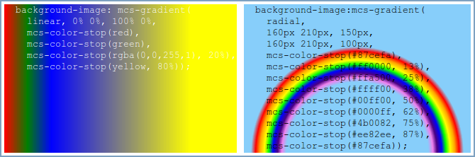
background-image: mcs-gradient(
  linear,
  0% 0%,
  100% 0%,
  mcs-color-stop(red),
  mcs-color-stop(green),
  mcs-color-stop(rgba(0,0,255,1), 20%),
  mcs-color-stop(yellow, 80%));
background-image:mcs-gradient(
radial,
160px 210px,
150px,
160px 210px,
100px,
mcs-color-stop(#87cefa),
mcs-color-stop(#ff0000, 13%),
mcs-color-stop(#ffa500, 25%),
mcs-color-stop(#ffff00, 38%),
mcs-color-stop(#00ff00, 50%),
mcs-color-stop(#0000ff, 62%),
mcs-color-stop(#4b0082, 75%),
mcs-color-stop(#ee82ee, 87%),
mcs-color-stop(#87cefa));Linear gradients
Linear gradients are described as either absolute or relative. Relative gradients are those whose gradient line is defined relative to the size of the box, i.e. those whose start and end points are specified using percentages or keywords. Absolute gradients are those whose start and end points are specified using at least one length value. It is worth noting that absolute gradients are less portable and work on a smaller set of browsers than relative gradients. Please refer to the section entitled Browser support for more information.
Linear gradients can also describe the direction of the gradient line. A horizontal linear gradient is one where the vertical components of the start and end points are the same. Similarly, a vertical linear gradient is one where the horizontal components of the start and end points are the same. A diagonal linear gradient starts at one intersection and ends at the opposite intersection after passing through the middle of the gradient area. Skewed gradients are those gradients whose gradient line does not fit into one of the previous categories. Please note that an absolute gradient that is not horizontal or vertical is treated as a skewed gradient.
The rules can be combined together as shown in The following table.
| Gradient | Relative | Absolute |
|---|---|---|
| Horizontal | |
|
| Vertical | |
|
| Diagonal | |
Not allowed. |
| Skewed | |
|
The color stop sequence is reversed and each color stop percentage is set to the value obtained from subtracting their percentage from 100%.
Browser support
MCS supports gradients on the following browsers:
-
WebKit based browsers that implement the -webkit-gradient(...) syntax.
-
Mozilla based browsers that implement the -moz-linear-gradient(...) syntax.
-
Internet Explorer based browsers that support the DXImageTransform.Microsoft.gradient filter.
WebKit based browsers support the broadest set of gradient types; Mozilla and Internet Explorer based browsers are more limited. The following restrictions apply:
-
The use of gradients with style properties other than background-image is only supported on WebKit based browsers.
-
Radial gradients are only supported on WebKit based browsers.
-
Relative diagonal gradients whose start and end points are at opposite corners are only supported on WebKit based browsers.
-
Absolute and skewed gradients are only supported on WebKit based browsers.
-
Relative horizontal and vertical gradients with multiple color stops and whose start and end points are on opposite edges are only supported on WebKit and Mozilla based browsers.
-
Relative horizontal and vertical gradients with only a color stop at the start (position 0%) and one at the end (position 100%) and whose start and end points are on opposite edges are supported on WebKit, Mozilla and Internet Explorer based browsers.
If a device does not support gradients, then the color specified by the background-color style property is used as the background color of an element.
The list of supported gradient types may be extended in future versions of MCS.
Example
<?xml version="1.0" encoding="UTF-8"?>
<html xmlns="http://www.w3.org/2002/06/xhtml2"
xmlns:mcs="http://www.volantis.com/xmlns/2006/01/xdime/mcs">
<head>
<title>Gradients</title>
<style type="text/css">
div#background_image_linear {
background-image: mcs-gradient(
linear,
0% 0%,
100% 0%,
mcs-color-stop(red),
mcs-color-stop(green),
mcs-color-stop(rgba(0,0,255,1), 20%),
mcs-color-stop(yellow, 80%));
background-color: red;
height: 210px;
color: black;
}
div#background_image_radial {
background-image:mcs-gradient(
  radial,
  160px 210px,
  150px,
  160px 210px,
  100px,
  mcs-color-stop(#87cefa),
  mcs-color-stop(#ff0000, 13%),
  mcs-color-stop(#ffa500, 25%),
  mcs-color-stop(#ffff00, 38%),
  mcs-color-stop(#00ff00, 50%),
  mcs-color-stop(#0000ff, 62%),
  mcs-color-stop(#4b0082, 75%),
  mcs-color-stop(#ee82ee, 87%),
  mcs-color-stop(#87cefa));
background-color: green;
height: 210px;
color: black;
}
ul#gradient {
list-style-image:mcs-gradient(linear,0px 0px, 5px 5px, mcs-color-stop(red), mcs-color-stop(yellow));
list-style-type:square;
}
</style>
</head>
<body>
<div>
<h5>Linear gradient:</h5>
<div id="background_image_linear">
<pre>
background-image: mcs-gradient(
linear,
0% 0%, 100% 0%,
mcs-color-stop(red),
mcs-color-stop(green),
mcs-color-stop(rgba(0,0,255,1), 20%),
mcs-color-stop(yellow, 80%));</pre>
</div>
<h5>Radial gradient:</h5>
<div id="background_image_radial">
<pre>
background-image:mcs-gradient(
radial,
160px 210px, 150px,
160px 210px, 100px,
mcs-color-stop(#87cefa),
mcs-color-stop(#ff0000, 13%),
mcs-color-stop(#ffa500, 25%),
mcs-color-stop(#ffff00, 38%),
mcs-color-stop(#00ff00, 50%),
mcs-color-stop(#0000ff, 62%),
mcs-color-stop(#4b0082, 75%),
mcs-color-stop(#ee82ee, 87%),
mcs-color-stop(#87cefa));</pre>
</div>
<h5>Gradients in list-style-image:</h5>
<ul id="gradient">
<li>list-style-image:mcs-gradient(linear, 0px 0px, 5px 5px, mcs-color-stop(red),
mcs-color-stop(yellow));</li>
<li>list-style-type:square</li>
</ul>
</div>
</body>
</html>