Members
(readonly) configOptions :Object
The options used to control how the configuration is displayed and edited. This member is optional. See editConfiguration to replace the built-in configuration editor. See drawConfiguration to provide custom text to display as the "Configuration" property value.
- Object
| Name | Type | Attributes | Description |
|---|---|---|---|
allowJsonEdit | Boolean | <optional> | If false, the edit button will not be displayed. |
topLevelProperties | Object.<string, TopLevelProperty> | <optional> | Top level property options. The string keys are the keys of the top level properties defined in the configuration JSON. |
configOptions =
{
	allowJsonEdit: false,
	topLevelProperties:
	{
		"Color":
		{
			required: true,
			type: "color",
			tooltip: "This is my color tooltip",
		},
		"Hover color":
		{
			required: true,
			type: "color",
			tooltip: "This is my hover color tooltip",
		}
	}
};
(readonly) dataSets :Object
Controls the display of datasets. This member is optional.
- Object
| Name | Type | Attributes | Description |
|---|---|---|---|
limits | DataSetLimits | <optional> | Define data set limits. |
strings | DataSetStrings | <optional> | String displayed in the data sets UI. |
dropZoneLabels | Array.<DataSetDropZoneLabel> | <optional> | Used to change labels for a specific dataset. Each entry in the array represents the labels for that data set index in the spec. |
allDropZoneVisibility | DataSetDropZoneVisibility | <optional> | Controls which drop zones are visible. |
dropZoneVisibility | Array.<DataSetDropZoneVisibility> | <optional> | Used to change labels for a specific dataset. Each entry in the array is applied to that specific data set index in the spec. |
Rename the categories and defaultMeasure drop zone labels for the second data set:
dataSets =
{
	dropZoneLabels:
	[
		{
		},
		{
			categories: "Slices",
			defaultMeasure: "Size"
		}
	]
};
Only display the category drop zone for all data sets:
dataSets =
{
	allDropZoneVisibility:
	{
		categories: true,
		values: false,
		defaultMeasure: false
	}
};
Only display the category drop zone for the first data set and only values for the second data set:
dataSets =
{
	dropZoneVisibility:
	[
		{
			categories: true,
			values: false,
			defaultMeasure: false
		},
		{
			categories: false,
			values: true,
			defaultMeasure: false
		}
	]
};
(readonly) initialization :Object
The initialization used when creating the <customControl/> in the spec. This member is optional. When the control is inserted, the configuration object is stringified and set as the text content of the <configuration/>. The remaining members are set as attributes on the <customControl/>.
- Object
| Name | Type | Attributes | Description |
|---|---|---|---|
configuration | Object | <optional> | The configuration JSON used to populate the |
path | String | <optional> | The value of the |
width | String | <optional> | The value of the |
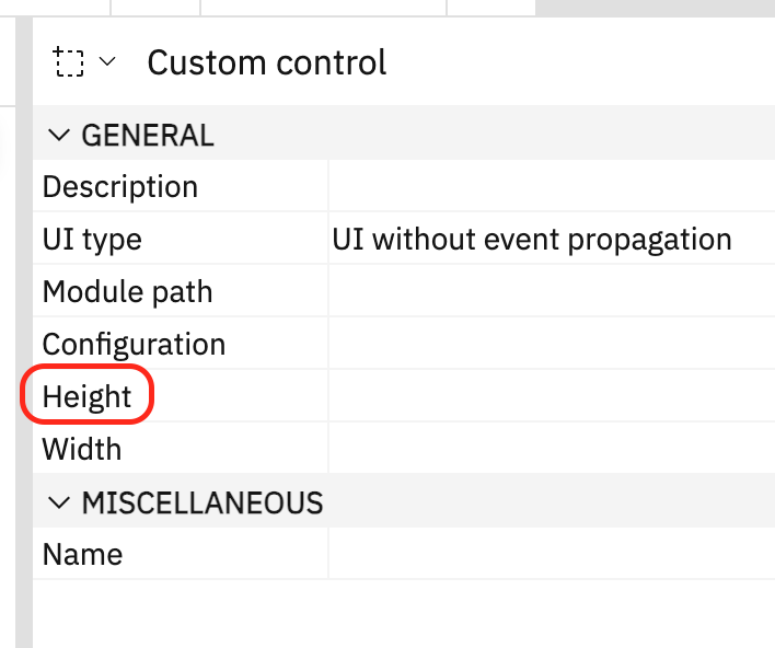
height | String | <optional> | The value of the |
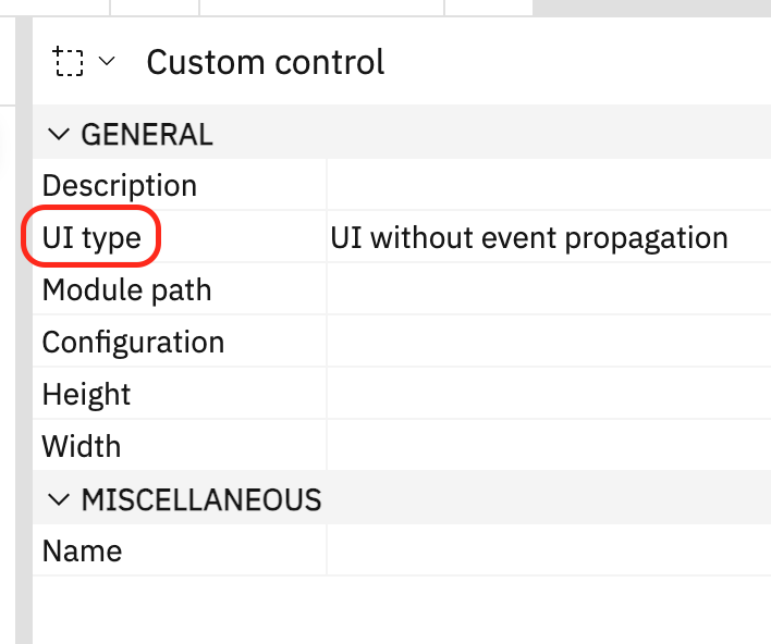
uiType | String | <optional> | The value of the |
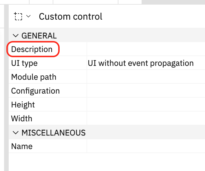
description | String | <optional> | The value of the |
initialization =
{
	configuration:
	{
		"Color": "red",
		"Hover color": "green"
	},
	path: "v1/ext/ExtensionName/CustomControlModule.js",
	width: "400px",
	height: "400px",
	uiType: "withEventPropagation"
};
(readonly) properties :Object
The display of properties can be controlled using the properties.visibility member. Only one of visibility.show or visibility.hide is supported. This member is optional.
- Object
| Name | Type | Attributes | Description | ||||||||||||
|---|---|---|---|---|---|---|---|---|---|---|---|---|---|---|---|
visibility | Object | <optional> | Properties
| ||||||||||||
labels | Object | Allows the renaming of properties in the property sheet. The object keys are the property names (from PropertySheet.xml) and values are the new labels to display. | |||||||||||||
descriptions | Object | Allows the overriding property descriptions. The object keys are the property names (from PropertySheet.xml) and values are the new descriptions to display. |
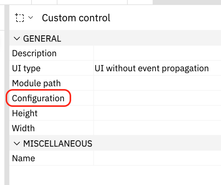
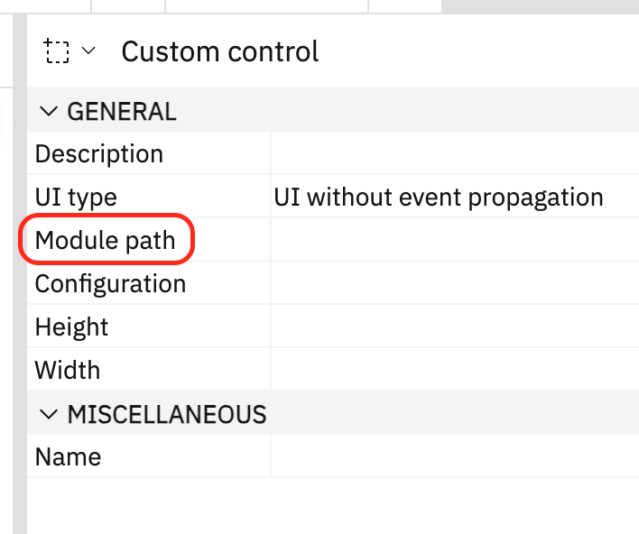
Hide the "Module path" and "UI type" properties:
properties =
{
	visibility:
	{
		hide: ["ccPath", "ccUiType"]
	}
};
Only show the "Configuration" property:
properties =
{
	visibility:
	{
		show: ["ccConfiguration"]
	}
};
Rename the "Configuration" property label to "Options":
properties =
{
	labels:
	{
		ccConfiguration: "Options"
	}
};
Override the "Configuration" property description:
properties =
{
	descriptions:
	{
		ccConfiguration: "My custom property description"
	}
};
(readonly) toolboxLocation :Object
The location in the toolbox where the control will be inserted. This member is optional. Controls can be placed in the toolbox relative (before/after) to an existing control or as the first or last entry in an existing group. If no location is specified, the control will be placed in a separate group that's only displayed if there are controls in it.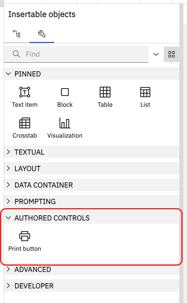
- Object
| Name | Type | Attributes | Description | |||||||||
|---|---|---|---|---|---|---|---|---|---|---|---|---|
group | Object | <optional> | Properties
| |||||||||
control | Object | <optional> | Properties
|
Insert the control after the "Text item" control: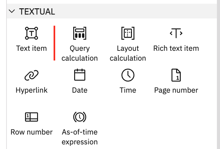
toolboxLocation =
{
	control:
	{
		id: "toolboxListTextItem",
		location: "after"
	}
};
Insert the control as the first entry in the "TEXTUAL" group: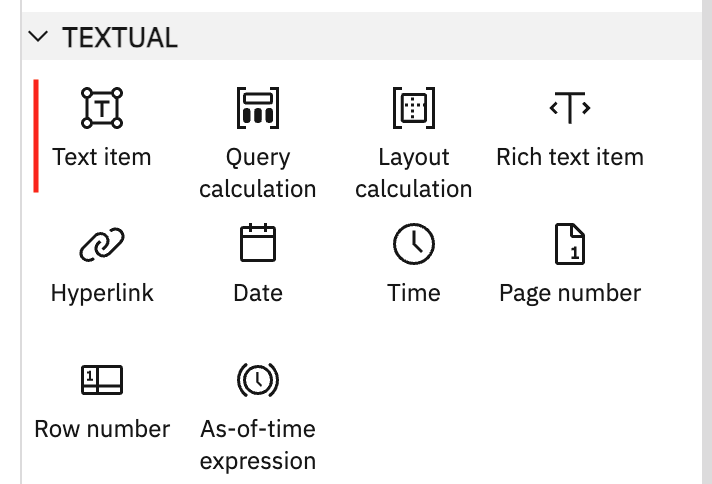
toolboxLocation =
{
	group:
	{
		id: "toolboxTextItemLabel",
		location: "first"
	}
};
Methods
draw(nCustomControl) → {String}
Draw the design-time UI of the control. The returned HTML string is used to render the control in design and preview view while authoring. The custom control element is passed in so that the draw code can be dynamic and respond to any spec changes. This method is optional.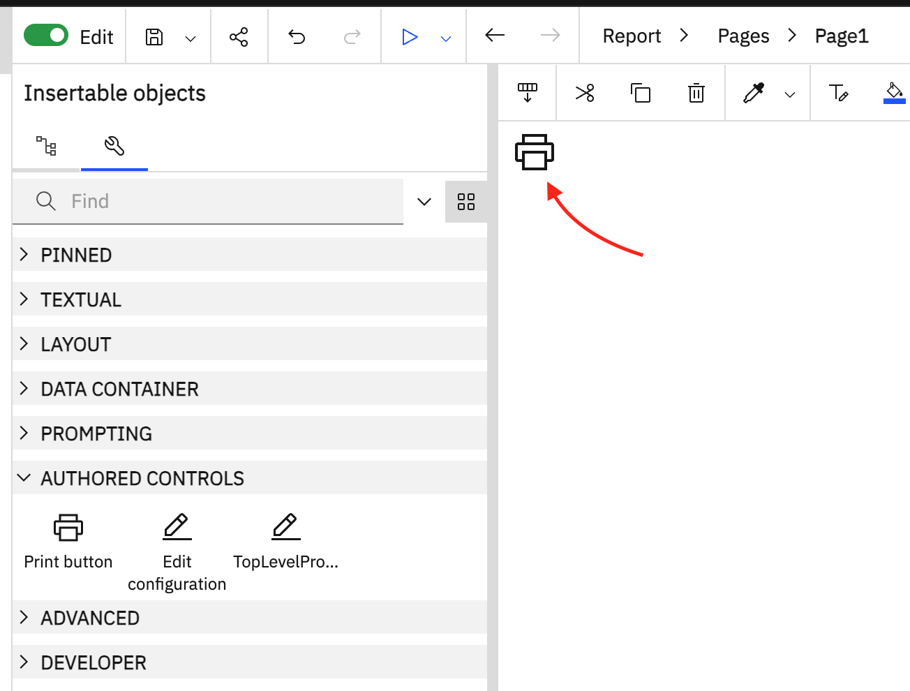
| Name | Type | Description |
|---|---|---|
nCustomControl | XMLElement | The custom control XML element (readonly). |
HTML representing the design-time UI of the control.
- Type:
- String
draw( nCustomControl )
{
	return `<svg viewBox="0 0 32 32" style="height:${nCustomControl.getAttribute( "height" ) ?? this.height}; width:${nCustomControl.getAttribute( "width" ) ?? this.width}"><use xlink:href="#def_my_icon"/></svg>`;
}drawConfiguration(nCustomControl, sConfiguration) → {String}
Draw the configuration text that is displayed for the "Configuration" property in the property sheet. This method is optional. This will be called when the control is selected and its properties are displayed.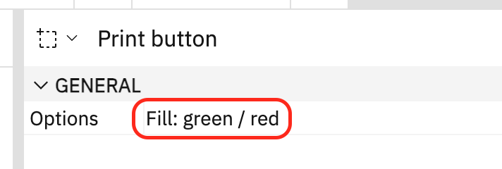
| Name | Type | Description |
|---|---|---|
nCustomControl | XMLElement | The custom control XML element (readonly). |
sConfiguration | String | The custom control configuration text content which is valid JSON. JSON.parse can be used to access the values. |
The configuration text to display in the property sheet. This is plain text and HTML is not supported.
- Type:
- String
drawConfiguration( nCustomControl, sConfiguration )
{
const o = JSON.parse( sConfiguration );
return `Fill: ${o["Fill color"] || "default"} / ${o["Hover color"] || "default"}`;
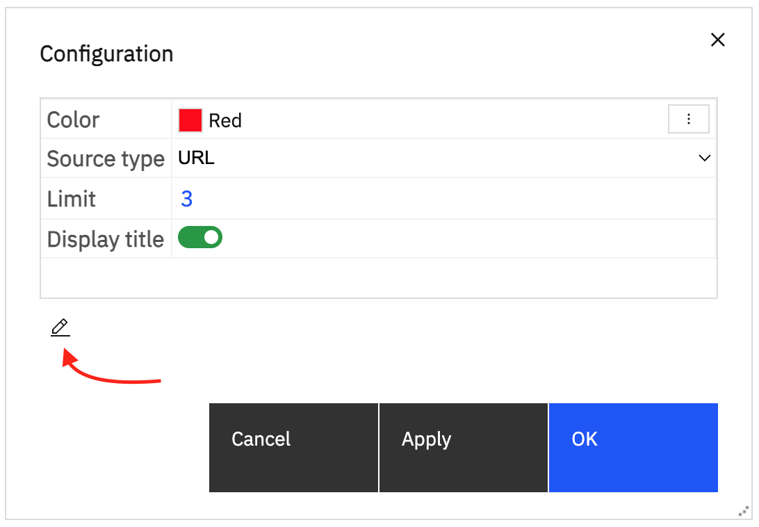
}(async) editConfiguration(nCustomControl, oConfiguration, divDialogBlocker) → (nullable) {Object}
Edit the configuration using a custom UI. This will be called instead of displaying the built-in configuration editor. This method is optional.
| Name | Type | Description |
|---|---|---|
nCustomControl | XMLElement | The custom control XML element (readonly). |
oConfiguration | Object | The parsed configuration JSON. |
divDialogBlocker | DIV | The HTML DIV dialog blocker. The DIV element covers the entire application when a dialog is displayed. Other than appending new elements, this DIV must not be modified in any other way. Any elements appended must be removed when the promise is resolved. |
The updated configuration, or null to remove the <configuration/>. If no value is returned, the specification is not modified.
- Type:
- Object
When the "Configuration" property is edited, prompt for a value using an HTML dialog and store the result in the configuration
editConfiguration( nCustomControl, oConfiguration, divDialogBlocker )
{
	return new Promise( fnResolve =>
	{
		const div = divDialogBlocker.appendChild( divDialogBlocker.ownerDocument.createElement( "DIV" ) );
		div.innerHTML =
			'<dialog> \
				<input type="text" autofocus></input> \
				<div> \
					<button>Cancel</button> \
					<button>OK</button> \
				</div> \
			</dialog>';
		const txt = div.querySelector( "INPUT" );
		txt.value = oConfiguration["Some Value"] ?? "";
		const [btnCancel, btnOK] = div.querySelectorAll( "BUTTON" );
		const elDialog = div.querySelector( "DIALOG" );
		const fnResolveAndClose = s =>
		{
			fnResolve( s && { "Some Value": s } );
			elDialog.close();
			div.remove();
		}
		btnOK.addEventListener( "click", () => fnResolveAndClose( txt.value ) );
		const fnCancel = () => fnResolveAndClose();
		btnCancel.addEventListener( "click", fnCancel );
		elDialog.addEventListener( "cancel", fnCancel );
		elDialog.showModal();
	} );
}
(async) initialize() → {Promise}
Initialize the design control. If an "initialize" function exists, it is called once after the designModule is loaded. It can be an async function or return a Promise, giving the ability to asynchronously load any required resources while the application waits. The current product locale is available on the global Application.locale. If localized strings are necessary, this is the best time to load them. This method is optional.
An optional promise that will be waited on.
- Type:
- Promise
Asynchronous initialization using an async function:
async initialize()
{
	await this.loadDependencies();
}
Asynchronous initialization using a Promise:
initialize()
{
	return new Promise( fnResolve =>
	{
		require( ["MyCode"], MyCode =>
		{
			MyCode.doSomething( Application.locale );
			fnResolve();
		} );
	} );
}