Page authors can use 2D and 3D transformations to modify elements in a two- or three-dimensional space. Elements can be scaled, rotated, translated and skewed.
Page authors can use 2D and 3D transformations to modify elements in a two- or three-dimensional space. Elements can be scaled, rotated, translated and skewed.
Please refer to http://www.w3.org/TR/css3-2d-transforms/ and http://www.w3.org/TR/css3-3d-transforms/ for more information.
Using 2D and 3D transformations
The mcs-transform, mcs-transform-style, mcs-backface-visibility, mcs-transform-origin-x, mcs-transform-origin-y and mcs-transform-origin-z properties allow page authors to configure 2D and 3D transformations.
The mcs-transform property specifies a sequence of transformations to be applied to an element. The following functions are supported:
- matrix(<number>, <number>, <number>, <number>, <number>, <number>)
-
Specifies a 2D transformation in the form of a transformation matrix. Please refer to http://www.w3.org/TR/SVG/coords.html#TransformMatrixDefined for details.
- matrix3d(<number>, <number>, <number>, <number>, <number>, <number>, <number>, <number>, <number>, <number>, <number>, <number>, <number>, <number>, <number>, <number>)
-
Specifies a 3D transformation in the form of a 4x4 homogeneous transformation matrix.
- perspective(<number>)
-
Specifies a perspective projection matrix. The value of the parameter represents the distance of the z=0 plane from the viewer. The value is given in pixels.
- rotate(<angle>)
-
Specifies a 2D rotation, i.e. rotates an element by the given angle around the origin of the element defined by the mcs-transform-origin-x and mcs-transform-origin-y properties.
- rotate3d(<number>, <number>, <number>, <angle>)
-
Specifies a clockwise 3D rotation by the angle defined by the <angle> parameter around the direction vector described by the first three parameters
- rotateX(<angle>)
-
Rotates an element by the specified angle around the X axis.
- rotateY(<angle>)
-
Rotates an element by the specified angle around the Y axis.
- rotateZ(<angle>)
-
Rotates an element by the specified angle around the Z axis.
- scale(<number>[, <number>])
-
Specifies a 2D scale operation, i.e. scales an element by the given scaling vector described by the two parameters. When the second parameter is not specified, then it is assumed to be the same as the first parameter.
- scale3d(<number>, <number>, <number>)
-
Specifies a 3D scale operation, i.e. scales an element by the given scaling vector described by the three parameters.
- scaleX(<number>)
-
Scales an element in the X direction.
- scaleY(<number>)
-
Scales an element in the Y direction.
- scaleZ(<number>)
-
Scales an element in the Z direction.
- skewX(<angle>)
-
Specifies a skew transformation along the X axis by the given angle.
- skewY(<angle>)
-
Specifies a skew transformation along the Y axis by the given angle.
- translate(<translation-value>[,<translation-value>])
-
Moves an element by the given vector in a two-dimensional space. If the second <translation-value> argument is not specified, then the element will not be transformed in the Y direction. The value of <translation-value> must be given as a percentage or as a length.
- translate3d(<translation-value>, <translation-value>, <translation-value>)
-
Moves an element by the given vector in a three-dimensional space.
- translateX(<translation-value>)
-
Moves an element in the X direction. The value of <translation-value> must be given as a percentage or as a length.
- translateY(<translation-value>)
-
Moves an element in the Y direction. The value of <translation-value> must be given as a percentage or as a length.
- translateZ(<translation-value>)
-
Moves an element in the Z direction. The value of <translation-value> must be given as a length.
- none
-
No transformation. This is the default value.
You use the mcs-transform-origin-x, mcs-transform-origin-y and mcs-transform-origin-z properties, or the mcs-transform-origin shorthand property, to specify the X, Y and Z coordinates of the origin for the transformations applied to an element. The value of the mcs-transform-origin-x property must be given as a percentage, length, or as the position keywords. The value of the mcs-transform-origin-y property must be given as a percentage, length, or as the position keywords. Both properties defaults to '50%'. The value of the mcs-transform-origin-z property must be given as a length. The property defaults to '0'.
The mcs-transform-style property specifies how nested elements should be rendered in 3D space. The default value of 'flat' means that all children of the element should be rendered flattened into the 2D plane of the element. The value of 'preserve-3d' indicates that all children of the element should maintain their positions in 3D space.
The mcs-backface-visibility property determines whether or not the back side of a transformed element should be visible when facing the viewer. The possible values are: 'visible' and 'hidden'. For example, a box built of 6 elements can have its inside faces visible or hidden.
For example, the following style rule will move an element by 40 pixels in both the X and Y directions, then scale the element by 130%, and finally rotate it 45 degrees clockwise about the Z axis.
mcs-transform: translate(40px,40px) scale(1.3,1.3) rotate(45deg);2D features
Support for all 2D transformations is represented by the following feature:
-
mcs:style.Transforms2D
Support for the individual transformations is represented by the following features.
Matrix:
-
mcs:style.Transforms2D#Matrix
Rotate:
-
mcs:style.Transforms2D#Rotate
Scale:
-
mcs:style.Transforms2D#ScaleX
-
mcs:style.Transforms2D#ScaleY
-
mcs:style.Transforms2D#Scale
Skew:
-
mcs:style.Transforms2D#SkewX
-
mcs:style.Transforms2D#SkewY
Translate:
-
mcs:style.Transforms2D#TranslateX
-
mcs:style.Transforms2D#TranslateY
-
mcs:style.Transforms2D#Translate
3D features
Support for all 2D and 3D transformations is represented by the following feature:
-
mcs:style.Transforms3D
Support for the individual transformations is represented by the following features.
Matrix:
-
mcs:style.Transforms3D#Matrix
Perspective:
-
mcs:style.Transforms3D#Perspective
Rotate:
-
mcs:style.Transforms3D#RotateX
-
mcs:style.Transforms3D#RotateY
-
mcs:style.Transforms3D#RotateZ
-
mcs:style.Transforms3D#Rotate
Scale:
-
mcs:style.Transforms3D#ScaleZ
-
mcs:style.Transforms3D#Scale
Translate:
-
mcs:style.Transforms3D#TranslateZ
-
mcs:style.Transforms3D#Translate
Example
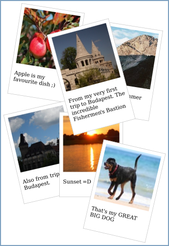
The following example illustrates the use of the 2D transformations.
<?xml version="1.0" encoding="UTF-8"?>
<html xmlns="http://www.w3.org/2002/06/xhtml2"
  xmlns:mcs="http://www.volantis.com/xmlns/2006/01/xdime/mcs"
  xmlns:sel="http://www.w3.org/2004/06/diselect">
  <head>
    <title>2D transformations</title>
    <style type="text/css">
      .cont {
        mcs-transform: scale(0.65) translateX(-75px) translateY(-350px);
      }
      .title {
        font-style:oblique;
        font-size: 20px;
        color: red;
        font-weight:bold;
        font-size: 20px;
        padding: 10px;
      }
      .photo {
        width: 170px;
        padding: 10px 10px 20px 10px;
        border: 1px solid #BFBFBF;
        background-color: white;
      }
      .first {
        mcs-transform: translate(15px,20px) rotate(9deg);
        mcs-transform-origin-x: 15px;
      }
      .second {
        mcs-transform: translate(250px,-190px) rotate(9deg) ;
      }
      .third {
        mcs-transform: translate(10px,-220px) rotate(-13deg) ;
      }
      .fourth {
        mcs-transform: translate(150px,-480px);
      }
      .fifth {
        mcs-transform: translate(150px,-1000px) rotate(-15deg);
       }
      .sixth {
        mcs-transform: translate(250px,-950px) rotate(13deg) ;
      }
      .pic object {
        display: block;
      }
      .desc {
        color: black;
      }
    </style>
  </head>
  <body>
    <sel:select>
      <sel:when expr="mcs:feature('mcs:style.Transforms2D')">
        <div class="cont">
          <div class="photo first">
            <object src="/images/gallery/photos/img2.mimg"/>
            <p class="desc">Apple is my favourite dish ;)</p>
          </div>
          <div class="photo second">
            <object src="/images/gallery/photos/img0.mimg"/>
            <p class="desc">From last summer hiking trip.</p>
          </div>
          <div class="photo third">
            <object src="/images/gallery/photos/img30.mimg"/>
            <p class="desc">Also from trip to Budapest.</p>
          </div>
          <div class="photo fourth">
            <object src="/images/gallery/photos/img25.mimg"/>
            <p class="desc">Sunset =D</p>
          </div>
          <div class="photo fifth">
            <object src="/images/gallery/photos/img18.mimg"/>
            <p class="desc">From my very first trip to Budapest. The incredible Fishermen's
              Bastion</p>
          </div>
          <div class="photo sixth">
            <object src="/images/gallery/photos/img7.mimg"/>
            <p class="desc">That's my GREAT BIG DOG</p>
          </div>
        </div>
      </sel:when>
      <sel:otherwise>
        <div class="warning"> Transforms are not supported </div>
      </sel:otherwise>
    </sel:select>
  </body>
</html>
The following example illustrates the use of the 3D transformations.
<?xml version="1.0" encoding="UTF-8"?>
<html xmlns="http://www.w3.org/2002/06/xhtml2"
  xmlns:mcs="http://www.volantis.com/xmlns/2006/01/xdime/mcs"
  xmlns:sel="http://www.w3.org/2004/06/diselect">
  <head>
    <title>3D Transform Examples</title>
    <style type="text/css">
      .title {
        font-style:oblique;
        font-size: 20px;
        color: red;
        font-weight:bold;
        font-size: 20px;
        padding: 10px;
      }
      .warning{
        color: red;
        padding: 4px;
      }
      .photo {
        width: 50px;
        height: 110px;
        padding: 3px 3px 6px 3px;
        border: 1px solid #BFBFBF;
        background-color: white;
      }
      .cont {
        mcs-transform: translateY(20px);
        mcs-transform-style: preserve-3d;
      }
      .first {
          mcs-transform: translate3d(10px, 40px, 30px) perspective(300) rotateY(20deg) scaleY(1.2) scaleX(1.8);
          mcs-transform-style: preserve-3d;
          mcs-transform-origin: left;
      }
      .second {
          mcs-transform: translate3d(8px,-115px,30px);
      }
      .third {
          mcs-transform: scaleY(1.2) scaleX(1.8) translate3d(70px,-60px,50px);
      }
      .fourth {
        mcs-transform: translateX(242px) translateY(-200px) perspective(300) rotateY(-20deg) scaleY(1.2) scaleX(1.8);
        mcs-transform-style: preserve-3d;
        mcs-transform-origin: right;
      }
      .fifth {
         mcs-transform: translate3d(-14px,-93px,30px);
      }
      .pic object {
        display: block;
      }
      .desc {
        color: black;
        font-size: 10px;
      }
    </style>
  </head>
  <body>
    <div>
      <sel:select>
        <sel:when expr="mcs:feature('mcs:style.Transforms3D')">
          <div class="cont">
            <div class="photo first">
              <object src="images/gallery/thumbs/img0_small.mimg"/>
              <p class="desc">From last summer hiking trip.</p>
              <div class="photo second">
                <object src="images/gallery/thumbs/img7_small.mimg"/>
                <p class="desc">That's my dog.</p>
              </div>
            </div>
            <div class="photo third">
              <object src="images/gallery/thumbs/img18_small.mimg"/>
              <p class="desc">The incredible Fishermen's Bastion</p>
            </div>
            <div class="photo fourth">
              <object src="images/gallery/thumbs/img25_small.mimg"/>
              <p class="desc">Sunset</p>
              <div class="photo fifth">
                <object src="images/gallery/thumbs/img30_small.mimg"/>
                <p class="desc">Also from the trip to Budapest.</p>
              </div>
            </div>
          </div>
        </sel:when>
        <sel:otherwise>
          <div class="warning"> 3D transforms are not supported. </div>
        </sel:otherwise>
      </sel:select>
    </div>
  </body>
</html>