Page authors can use the mcs-box-shadow property to create a blurred and shifted copy of an element that is intended to imitate a shadow effect.
Page authors can use the mcs-box-shadow property to create a blurred and shifted copy of an element that is intended to imitate a shadow effect.
Using the mcs-box-shadow property
The mcs-box-shadow property accepts a sequence of comma-separated rules; each rule defines a single shadow effect:
mcs-box-shadow: inset <color> <offset-x> <offset-y> <blur-radius> <spread-radius>;where:
- inset
-
An optional keyword which, if present, changes the shadow from an outer shadow to an inner shadow.
- <color>
-
The color for the shadow effect represented by a color name or a hex code.
- <offset-x>, <offset-y>
-
Length values that define the horizontal and vertical distance of the shadow, relative to the element.
- <blur-radius>
-
An optional length value that specifies the blur radius of the shadow; the higher the value, the bigger the blur effect and the shadow becomes wider and lighter. The default value is '0', i.e. no blur.
- <spread-radius>
-
An optional length value that specifies the spread distance. A positive value causes the shadow to expand in all directions by the specified radius. A negative value causes the shadow to shrink. The default value is '0', i.e. the shadow will be of the same size as the element.
Example
<?xml version="1.0" encoding="UTF-8"?>
<html xmlns="http://www.w3.org/2002/06/xhtml2"
xmlns:mcs="http://www.volantis.com/xmlns/2006/01/xdime/mcs">
<head>
<title>Box shadows</title>
<style type="text/css">
div.sample {
background-color: #23516a;
width: 250px;
height: 30px;
margin: 20px 20px 10px 20px;
padding: 3px;
}
div#simple {
mcs-box-shadow: blue 4px 5px;
}
div#blur {
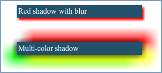
mcs-box-shadow: red 4px 5px 6px;
}
div#spread {
mcs-box-shadow: yellow 4px 5px 6px 7px;
}
div#multi {
mcs-box-shadow: black 0 0 20px, yellow 20px 15px 30px, lime -20px 15px 30px, blue -20px -15px 30px, red 20px -15px 30px;
}
div#simple_inset {
mcs-box-shadow: inset green 10px 10px 20px;
}
</style>
</head>
<body>
<div>
<div id="simple" class="sample"> Blue shadow </div>
<div>
<pre>mcs-box-shadow: blue 4px 5px;</pre>
</div>
<div id="blur" class="sample"> Red shadow with blur </div>
<div>
<pre>mcs-box-shadow: red 4px 5px 6px;</pre>
</div>
<div id="spread" class="sample"> Yellow shadow with blur and spread </div>
<div>
<pre>mcs-box-shadow: yellow 4px 5px 6px 7px;</pre>
</div>
<div id="simple_inset" class="sample"> Green inset shadow </div>
<div>
<pre>mcs-box-shadow: inset green 10px 10px 20px;</pre>
</div>
<div id="multi" class="sample"> Multi-color shadow </div>
<div>
<pre>
mcs-box-shadow:
black 0 0 20px,
yellow 20px 15px 30px,
lime -20px 15px 30px,
blue -20px -15px 30px,
red 20px -15px 30px;</pre></div>
</div>
</body>
</html>