An XDIME page can consist of header, content and footer sections.
An XDIME page can consist of header, content and footer sections.
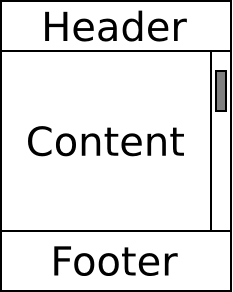
The following diagram illustrates the relationship between header, content and footer regions.
If the previously described behavior cannot be achieved on the target device, then the contents of the footer will be displayed at the end of the page and the scrollbar will be associated with the body of the page.
Viewport layouts
There are several types of layouts. Page layouts specify the physical position of elements on pages. Viewport layouts can be associated with a browser viewport, i.e. the area through which a page is viewed. A viewport layout must consist of a single column grid with at most 3 rows. Each row can contain a single region. If it has 3 rows, then the first row must contain the header region, the second row needs to contain the content region, and the third row must contain the footer region. The header and footer regions and the rows they occupy are optional, i.e. a viewport layout can consist of only the header and content regions, or only the content and footer regions.
The header, footer and content regions are identified by their destination area properties. The following table lists the supported values.
| Region Type | Destination Area Value |
|---|---|
| Header | ViewportHeader |
| Content | ViewportContent |
| Footer | ViewportFooter |
A viewport layout should look like the following example.

<?xml version="1.0" encoding="UTF-8"?>
<variable-policy xmlns="http://www.volantis.com/xmlns/2011/06/marlin-lpdm"
  xmlns:xsi="http://www.w3.org/2001/XMLSchema-instance"
  xmlns:rpdm="http://www.volantis.com/xmlns/2011/06/marlin-rpdm"
  xmlns:struct="http://www.volantis.com/xmlns/2005/10/ThemeStruct"
  xsi:schemaLocation="http://www.volantis.com/xmlns/2011/06/marlin-lpdm
    http://www.volantis.com/schema/2011/06/marlin-lpdm.xsd">
  <type>layout</type>
  <variants>
    <variant>
      <type>layout</type>
      <selection>
        <targeted>
          <devices>
            <device>Master</device>
          </devices>
        </targeted>
      </selection>
      <content>
        <layout>
          <canvasLayout type="viewport">
            <gridFormat name="ViewportLayoutGrid" rows="3" columns="1"
              optimizationLevel="never" styleClass="ViewportLayoutGrid">
              <gridFormatColumns>
                <gridFormatColumn widthUnits="percent"/>
              </gridFormatColumns>
              <gridFormatRow>
                <regionFormat name="Header" destinationArea="ViewportHeader"
                  styleClass="GridHeaderRegion"/>
              </gridFormatRow>
              <gridFormatRow>
                <regionFormat name="Content" destinationArea="ViewportContent"
                  styleClass="GridContentRegion"/>
              </gridFormatRow>
              <gridFormatRow>
                <regionFormat name="Footer" destinationArea="ViewportFooter"
                  styleClass="GridFooterRegion"/>
              </gridFormatRow>
            </gridFormat>
          </canvasLayout>
        </layout>
      </content>
    </variant>
  </variants>
</variable-policy>
The styleClass attribute allows page authors to associate a class name with the selected region of a viewport layout, and then use a theme policy to define style rules for values such as fonts, colors, backgrounds, etc.
At present it is impossible to specify the type="viewport" attribute on the canvasLayout element and the styleClass attribute using the MCS layout editor, i.e. in order to create a viewport layout and apply styling to the grid and the regions, page authors must edit the policy manually.
XDIME 2 elements
The mcs:header and mcs:footer elements define a header and a footer for a document. You use the mcs-container style property to identify the layout container for the content in each case. Multiple instances of mcs:header and mcs:footer can appear within an XDIME 2 page. All elements of the same type will be grouped together and rendered as a single header or footer section.
<?xml version="1.0" encoding="UTF-8"?>
<html xmlns="http://www.w3.org/2002/06/xhtml2"
  xmlns:mcs="http://www.volantis.com/xmlns/2006/01/xdime/mcs">
  <head>
    <title>Header and Footer</title>
    <link rel="mcs:layout" href="/layouts/hf-layout.mlyt"/>
    <link rel="mcs:theme" href="/themes/hf-theme.mthm"/>
  </head>
  <body>
    <mcs:header style="mcs-container: 'Header'">
      <div id="logo"/>
    </mcs:header>
    <mcs:header style="mcs-container: 'Header'">
      <object src="/images/heading.mimg"/>
    </mcs:header>
    <mcs:header style="mcs-container: 'Header'">
      <div id="title"> Header and Footer </div>
    </mcs:header>
    <div style="mcs-container: 'Content'">
      <p>Lorem ipsum dolor sit amet, consectetur adipisicing elit, sed do
        eiusmod tempor incididunt ut labore et dolore magna aliqua. Ut
        enim ad minim veniam, quis nostrud exercitation ullamco laboris
        nisi ut aliquip ex ea commodo consequat. Duis aute irure dolor in
        reprehenderit in voluptate velit esse cillum dolore eu fugiat nulla
        pariatur. Excepteur sint occaecat cupidatat non proident, sunt in
        culpa qui officia deserunt mollit anim id est laborum.</p>
    </div>
    <mcs:footer style="mcs-container: 'Footer'">
      <div id="footer">
        <ul>
          <li>
            <a href="index.xdime">Site homepage</a>
          </li>
          <li>
            <a href="http://www.antennasoftware.com">Antenna Software homepage</a>
          </li>
        </ul>
      </div>
    </mcs:footer>
    <mcs:footer style="mcs-container: 'Footer'">
      <div id="copyright">Copyright Antenna Software 2009</div>
    </mcs:footer>
  </body>
</html>
Styles
Page authors can apply style properties to the outermost grid and to the individual regions, but styles from the grid column, rows and cells are ignored. The following rules apply:
-
The heights of the regions can be specified using the height, min-height and/or max-height properties. The grid must fill the entire viewport, i.e. its width and height properties must be set to 100% of the viewport, and the regions must completely cover the grid and be as wide as the viewport.
-
The margin, padding and borders properties are not allowed on either the grid, or the regions.
-
Properties and keywords from the Flexible Box model can be applied to the grid and the regions, but the following restrictions apply:
-
The grid must have the following styles:
display: mcs-box; mcs-box-align: stretch; mcs-box-orient: vertical; -
The header and footer regions must have the following styles:
mcs-box-flex: 0; -
The content region must have the following styles:
mcs-box-flex: 1;
-
-
The following styles must be applied to the grid for the 'Master' device:
.ViewportLayoutGrid{ position:absolute; } -
The following styles must be applied to the grid and the content region for the 'PC-UNIX' and 'PC-Win32' devices:
.ViewportLayoutGrid{
  position:static;
}
.GridContentRegion{
  overflow-y:auto;
}
Page authors can specify the size of the various regions in the viewport in a couple of different ways:
-
Using the Flexible Box model properties. This is the best approach because it insulates page authors from having to deal with the majority of the issues caused by differences in device viewport sizes.
-
Using fixed heights for the regions. In this case, page authors should calculate the heights for the regions based both on the device dimensions and also on the content that will be contained within. Note that as the sum of the heights must be equal to the height of the viewport.
-
Using percentage heights for the regions. In this case, when the height of the viewport increases, the space used by the regions will increase proportionally. Again, the sum of the heights has to be equal to the height of the viewport.
Features
Support for the header and footer elements is represented by the following feature:
-
mcs:viewport.layout#HeaderFooter