The Client Framework 2 provides several simple, yet powerful components, such as buttons or event handlers, that are used across the Client Framework 2 applications. In this module we will use those components to create a popup.
The Client Framework 2 provides several simple, yet powerful components, such as buttons or event handlers, that are used across the Client Framework 2 applications. In this module we will use those components to create a popup.
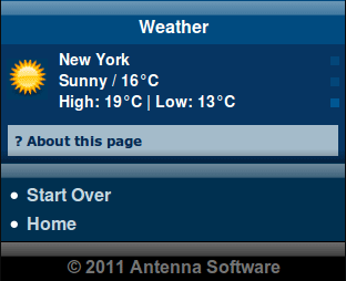
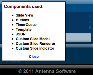
The page will contain an initially hidden popup. The user can open the popup by clicking the '? About this page' link. The "Close" button allows users to dismiss the popup.
Box
-
ui:box is a structural element and can contain arbitrary markup. ui:box can be initially hidden in the page sent to the device, i.e. have the initial-displayed-state attribute set to 'false', and therefore it can be shown dynamically in response to some event. We will use the ui:box element to create the popup.
<ui:box id="about_box" initial-displayed-state="false"> <span>Components used:</span> <ul> <li>Slide View</li> <li>Buttons</li> <li>TimerQueue</li> <li>Template</li> <li>JSON</li> <li>Custom Slide Model</li> <li>Custom Slide Renderer</li> <li>Custom Slide Indicator</li> </ul> <div style="text-align: center"> <ui:button> <span>Close</span> <cf2:on event="cf2:activate" set="about_box#displayed" boolean="false"/> </ui:button> </div> </ui:box> -
The popup contains information about the components used to create the page. In addition, it contains a dismiss button.
Button
The ui:button element provides a button-like control used by the Client Framework 2.
-
The cf2:activate event is fired whenever the button is clicked. This causes the 'about_box' box to be displayed on the page, i.e. when the user clicks '? About this page', the displayed observable property of the ui:box element with the id attribute set to 'about_box' is changed to 'true'. Please see cf2:ui.DynamicProperties#Displayed for more information.
<ui:button> <span style="color: #052a53">? About this page</span> <cf2:on event="cf2:activate" set="about_box#displayed" boolean="true"/> </ui:button> -
The 'Close' button, when clicked, hides the popup by setting the displayed property of the 'about_box' box back to 'false'.
Complete XDIME code
The Weather page has to contain the following code.
<?xml version="1.0" encoding="UTF-8"?>
<html xmlns="http://www.w3.org/2002/06/xhtml2"
xmlns:mcs="http://www.volantis.com/xmlns/2006/01/xdime/mcs"
xmlns:cf2="http://www.volantis.com/xmlns/2009/07/cf2"
xmlns:ui="http://www.volantis.com/xmlns/2009/07/cf2/ui"
xmlns:event="http://www.w3.org/2001/xml-events"
xmlns:cst="http://www.volantis.com/xmlns/2009/07/cf2/template"
xmlns:json="http://www.volantis.com/xmlns/2009/07/json"
xmlns:urid="http://www.volantis.com/xmlns/marlin-uri-driver">
<head>
<title>Weather</title>
<link rel="mcs:theme" href="/themes/main_cf2t.mthm"/>
<link rel="mcs:layout" href="/layouts/main_cf2t.mlyt"/>
<mcs:script src="/scripts/slide-model_cf2t.mscr"/>
<mcs:script src="/scripts/slide-renderer_cf2t.mscr"/>
<mcs:script src="/scripts/slide-view-template_cf2t.mscr"/>
<mcs:script src="/scripts/slide-indicator_cf2t.mscr"/>
</head>
<body>
<div id="title" style="mcs-container: 'title'">
<div class="glass-bar"/>
<span>Weather</span>
</div>
<div id="content" style="mcs-container: 'content';">
<ui:box id="about_box" initial-displayed-state="false">
<span>Components used:</span>
<ul>
<li>Slide View</li>
<li>Buttons</li>
<li>TimerQueue</li>
<li>Template</li>
<li>JSON</li>
<li>Custom Slide Model</li>
<li>Custom Slide Renderer</li>
<li>Custom Slide Indicator</li>
</ul>
<div style="text-align: center">
<ui:button>
<span>Close</span>
<cf2:on event="cf2:activate" set="about_box#displayed" boolean="false"/>
</ui:button>
</div>
</ui:box>
<div style="mcs-layout: 'layouts/ui_cf2t.mlyt'">
<div id="ui-content" style="mcs-container: 'ui-header'" class="biscuit_bg">
<ui:slide-view id="slide" model="model" renderer="renderer"/>
<cst:template id="tmpl">
<div style="mcs-layout: 'layouts/biscuit-tmpl_cf2t.mlyt'">
<cst:image style="mcs-container: 'icon'" path="icon"/>
<div style="mcs-container: 'details'">
<div class="bTitle"><cst:value path="city"/></div>
<div><cst:value path="condition"/> / <cst:value path="temp"/></div>
<div>High: <cst:value path="temp_high"/> | Low: <cst:value path="temp_low"/></div>
</div>
<div id="indicator" style="mcs-container: 'indicator'"/>
</div>
</cst:template>
</div>
</div>
<div id="about">
<ui:button>
<span style="color: #052a53">? About this page</span>
<cf2:on event="cf2:activate" set="about_box#displayed" boolean="true"/>
</ui:button>
</div>
</div>
<div id="footer" style="mcs-container: 'footer'">
<div class="shadow-bottom-bar"/>
<div class="glass-bar"/>
<ul>
<li>
<a href="/mcs/projects/examples/cf2/index.xdime">Start Over</a>
</li>
<li>
<a href="/mcs/projects/welcome/welcome.xdime">Home</a>
</li>
</ul>
<div id="copyright">
<div class="glass-bar"/> © 2011 Antenna Software </div>
</div>
</body>
</html>Checklist
Client Framework 2 Component
| Name | Purpose |
|---|---|
| Box | This component can be used to build low level custom components. |
| Button | A button-like control used by the Client Framework 2. |
| cf2:dom.Element#Styles | Allows authors to fix device specific issues with setting styles on an element. |
| cf2:ui.DynamicProperties#Displayed | Determines whether a component is displayed or not. When the property is set to 'true', the component is in the displayed state. When the property is set to 'false', then the component is in the concealed state, i.e. it is not displayed. |
| Common JavaScript methods | Several UI components and containers share some JavaScript methods. Rather than list them repeatedly for each component. |
XDIME Elements
| Name | Purpose |
|---|---|
| a | Used to create an explicit link to another place in the same document or to another document. The current document is the source of the link and the value of the href attribute, defines the link target |
| body | Contains the document's content. |
| div | A section used to add extra structure to documents. Style sheets can be used to control the presentation. |
| head | Information such as the title and other metadata that is not document content. The contained title element is required and it must be the first child of the head element. |
| html | The container for the XDIME 2 document. |
| li | A list item in an ordered, unordered or navigation list. |
| link | Defines a link. Multiple links and relationships may be defined for a single document. Refer to the topic entitled Document relationship links for more information. |
| object | A reference to a media resource. Object allows a variety of media resources to be placed on the rendered page. The resource may be specified as an image policy or a device dependent mime type. Object also allows the control of media transcoding to ensure the resource will render on the requesting agent. See References to media for details. |
| param | Defines an optional parameter value for an object. |
| span | Inline element used to set a style. |
| title | The title element is used to identify the document. title is required and it must be the first child of the head element. |
| ul | A list of unordered items. |
| cf2:on | Registers an event handler on a component. |
| cf2:param | Defines an optional parameter value passed into the handler's JavaScript method. |
| cst:image | Defines an image slot within a client-side template. |
| cst:template | The template element within the Client Framework 2 user interface. |
| cst:value | A template slot which allows the body content of an element to be set from the data in the template. |
| json:array | Represents a JSON array structure. |
| json:inline | Container for the JSON elements that allows them to be used within a Client Framework 2 page. |
| json:object | Represents a JSON object structure. |
| json:property | Represents a JSON property. |
| json:string | Represents a JSON string value. |
| mcs:script | Refers to an external script or to a script policy, or contains a script. |
| ui:box | The box component for the Client Framework 2 user interface. |
| ui:button | A button-like control used by the Client Framework 2. |
| ui:slide-view | Displays slides from a specified set. It presents one slide at a time. All slides must be of the same size. The contents of each slide is retrieved from the underlying model. The corresponding renderer defines how to display the data on an XDIME page. |
| urid:fetch | Specifies a driver URI. |