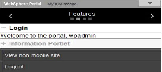
The accordion navigation view displays portlets by expanding or collapsing content vertically.
Description
In this view, portlets can be expanded or collapsed (maximized or minimized) in a vertical menu. By default, the first portlet begins in the expanded mode while the others are in the collapsed mode.
Implementation details
In ControlSmartphone.jsp, a <div> or <span> tag with id wraps around the portlet body. The portlet content and title are wrapped so that the element can be fetched by its ID from JavaScript and its style can be changed.
<pane name="TITLE">
<div id="<%=portletCount%>_portlettitle" class="fold-items">
……..

<region name="PORTLET_FRAGMENT">
		<span id="<%=portletCount%>_portletbody">
			Portlet content
………….
……..
The ID for each portlet body and title is unique and is suffixed with _portletbody and _portlettile. In this view, when clicking the portlet title, the portlet body is displayed or hidden.
// toggle (expand the portlet or collapse the portlet)
Collapse: function(/*portlet title node */n, /*portlet body node*/n1) {
      		//(1) Hide the n1
//(2) Change the styling of “n” so that it
      looks like it’s collapsed.
          }
Expand: function(/*portlet title node */n, /*portlet body node*/n1) {
      		//(1) Unhide/Open the n1
//(2) Change the styling of “n” so that it
      looks like it’s expanded.
        }
The login portlet is expanded at startup, while the Information Portlet is collapsed.
