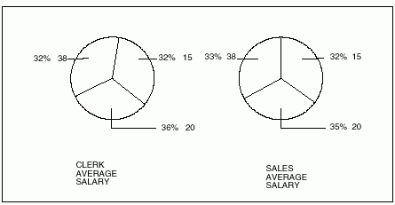
Pie charts are unique in that they do not have a typical X-axis and Y-axis. Compare the report in Figure 135 and the pie chart in Figure 136 to see how QMF displays data on a pie chart.
Figure 135. This report shows department salary averages.
+--------------------------------------------------------------------------------+
|       <--------- JOB ---------->                                               |
|       <- CLERK -->  <- SALES -->  <- TOTAL -->                                 |
|          AVERAGE     AVERAGE       AVERAGE                                     |
| DEPT     SALARY      SALARY        SALARY                                      |
| ----   ----------    ----------    ----------                                  |
|   15   12383.35      16502.83      13756.51                                    |
|   20   13878.68      18171.25      15309.53                                    |
|   38   12482.25      17407.15      14944.70                                    |
|        ========      ========      =========                                   |
|        12914.76      17372.10      14697.69                                    |
|                                                                                |
|                                                                                |
+--------------------------------------------------------------------------------+
Figure 136. The pie chart displays the same data.

Each numeric column (called Y-data columns) produces a separate pie. QMF displays column data as labels attached to the pie slices. It displays column headings as titles for the pies.
Because each numeric column on a report produces a separate pie, you probably won't want to use a pie chart to display data from reports with more than two numeric columns.