The Tracker tool provides reports that display a database usage history for queries that have been managed by the DB2 Query Patroller system. For example, Tracker allows you to determine which tables and columns have been accessed most frequently, which tables have returned the most result rows, and which jobs have been completed within a specific time period.
The information displayed by Tracker is gathered by DB2 Query Patroller running on your database server. DB2 Query Patroller collects job accounting data, which is then analyzed by the iwm_tracker program. The iwm_tracker program is the back-end parser for DB2 Query Patroller, which analyzes data for successfully completed job runs. Each time the iwm_tracker program runs, it examines any job accounting entries added since its last run.
| Note: | Because the user iwm owns the DB2 explain tables, you must be logged on as the user iwm to run iwm_tracker successfully. The Tracker tool uses data from DB2 explain tables to create reports. |
Before running Tracker for the first time, you must perform the following steps:
This section describes the different reports that can be viewed using the Tracker tool.
There are four basic types of predefined reports that are generated when the Tracker tool is run:
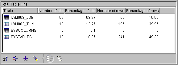
The Total Table Hits report identifies the tables that have been accessed by queries submitted against the database within the defined date range. It tells you the number of times each table has been accessed, and the number of rows that have been returned from each table. This type of report may reveal certain tables to be heavily accessed, making them good candidates for being located on rapid-access devices.
For each table hit, the Total Table Hits report gives you the following information:
An example of a Total Table Hits report is given below. This report
shows the number of hits on the table IWM003_JOB_ACCT and the number of rows
returned from that table.

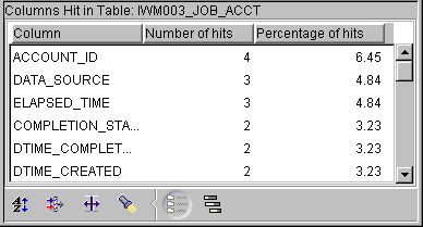
The Columns Hit in Table X report lists each column in a specific table and the number of times the column has been accessed by queries within the defined date range. The report also shows the percentage of hits per column relative to the hits on all columns in the table. This type of report displays the columns in a table that are queried most frequently. To optimize access, you may want to create indexes for the most frequently accessed columns.
An example of a Columns Hit in Table X report is given below. This
report displays the number of hits on each of the columns in the table
IWM003_JOB_ACCT.
The Users That Hit Table X report lists the ID of each user accessing a specific table and the number of times the table is accessed by that user within the defined date range. The report also shows the percentage of hits on the table by a user relative to hits by all users. You can examine the details of a particular user's access to a table by viewing the Columns Hit by User Y Hitting Table X report.
This type of report might reveal trends of heavy resource use by certain individuals, perhaps indicating a need for stricter user constraints.
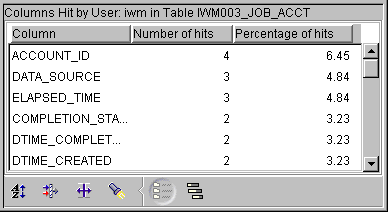
The Columns Hit by User Y Hitting Table X report lists the columns accessed by a specific user for a specific table and the number of times those columns were accessed within the defined date range. The report also shows the percentage of times each column was accessed by a specific user relative to the total hits on all columns in that table by that user.
An example of a Columns Hit by User Y in Table X Report is given
below. This report displays a list of columns that were hit by the user
IWM in the table IWM003_JOB_ACCT. For each column, the report displays
the number of times it was accessed by the user IWM.
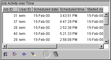
The Job Activity over Time report displays all the jobs that were completed between the defined start and end dates. This type of report might reveal job trends, such as periods of heavy usage or slow response times. This type of information might point to a need to reallocate resources during high-demand periods, or to reschedule non-critical jobs to alleviate some of the database workload.
For each job, the report provides the following information:
Additional job detail information, such as execution cost, the number of result rows, result set destination, and the SQL statement, can be viewed by double-clicking on a specific job in the list to open the Job Detail Information window.
An example of a Job Activity over Time Report is given below. This
report displays the details of jobs executed from 1:00 pm to 6:00
pm on February 15, 2000.
This section describes how to start and stop Tracker and how to use Tracker to display job history data.
Complete the following steps to start the Tracker tool:
db2track
The Tracker Login window opens.
| Note: | The user ID and password are case sensitive. |
The Tracker Window is illustrated below:
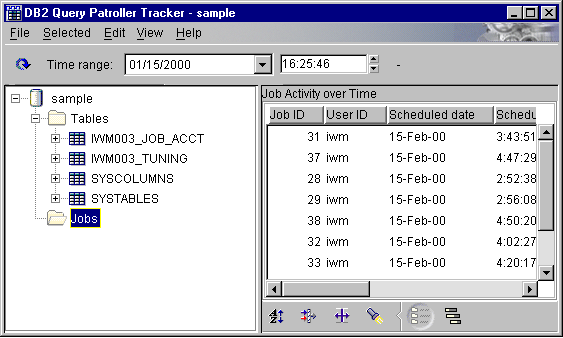
There are four major areas in the Tracker window. At the top of the window is the menu bar, consisting of drop-down menus of actions to perform within the Tracker tool. Below the menu bar is the Time Range settings area. In this area, you can set the time range for Tracker reports. For information on changing the date and time range, see Changing the Date and Time Range.
| Note: | If you reduce the size of the Tracker window, the settings for the end of the time range disappear, as shown in the example above. To view these settings, simply increase the size of the Tracker window. |
The remainder of the Tracker window is split into two areas. On the left side is a navigation tree for selecting reports to view. The area on the right side of the screen displays the selected report. The report that is displayed when you open the Tracker tool is the Total Table Hits report. For information on viewing other reports, see Using the Tracker Report Navigator.
On the left side of the Tracker window is an area containing a directory
tree of folders and reports. An example directory is illustrated
below:
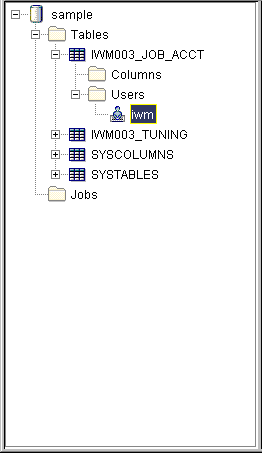
At the top of the directory tree is a database icon representing the database that was used in the tracked queries. Below this icon is a folder labeled Tables and a folder labeled Jobs. When each of these folders is highlighted, the folder icon is open, and the corresponding report is displayed in the report area on the right of the Tracker window. A + sign next to an icon indicates that the directory may be expanded to reveal dependents. To expand the directory, click on the +.
When you click on the + next to the Tables folder icon, you see a list of all the tables that have been accessed during the specified time range. Clicking on the icon for each table reveals a short report in the report area of the Tracker window. This report tells you how many times that table was hit during the time range, and what percentage those hits represent relative to the number of hits on all the tables.
If you click on the + next to a particular table icon, two folders appear below that icon: a Columns folder and a Users folder.
If you click on the Columns folder under a table icon, the Columns Hit in Table X report appears in the report area of the Tracker window. For more information on this type of report, see Columns Hit in Table X Report.
If you click on the Users folder under a table icon, the Users that Hit Table X appears in the report area of the Tracker window. For more information on this type of report, see Users That Hit Table X Report. To expand this directory, click on the + next to the Users folder. Below the Users folder for a particular table is an icon for every user that has accessed that table. Clicking on the icon for User Y reveals a Columns Hit by User Y in Table X report in the report area of the Tracker window.
The Jobs folder has no dependent items so there is no + next to it. If you click on the Jobs folder, the Job Activity over Time report appears in the report area of the Tracker window. For more information on this type of report, see Job Activity over Time Report.
The Tracker application allows you to customize the display of reports in several different ways. You can sort the items in the report by any column, apply filters to the reduce the scope of the report, and select a subset of columns to display. You can also choose to view the report as a chart or as a graph.
At the bottom of the report area in the Tracker window is a menu of icons that allow you to customize the view of the report. The icons are described in the table below:
 | Sort. This icon allows you to sort by different columns in ascending or descending order. |
 | Filter. This icon allows you to apply a filter to the report and display only the data meeting specified criteria. |
 | Customize Columns. This icon allows you to display only selected columns of the report. |
 | Find. This icon allows you to find a specified string in the report. |
 | View Details. This icon allows you to view the report in a detailed chart. |
 | View Graph. This icon allows you to view the report as a graph. |
You can sort a Tracker report when it is displayed in chart view. To do a customized sort on a report, perform the following steps:
You can customize reports produced by the Tracker tool by applying filters to the report contents. To apply a filter to a report, perform the following steps:
You can customize the reports generated in the Tracker tool by selecting the columns that appear in the report, and specifying the order they appear in. To customize the columns, perform the following steps:
To find a string in a report, perform the following steps:
To view a report in chart format, click the View Details icon at the bottom of the report area in the Tracker window. You can also use the menu bar at the top of the window, selecting View --> By Details. The report appears as a set of row items and columns.
In this format, you can change the sort order for a column from ascending to descending by clicking on the title area of the column. Clicking once on the column title sorts the data by that column in ascending order. An arrow pointing upward appears next to the column title.
Clicking a second time sorts the data by that column in descending order. An arrow pointing downward appears next to the column title. A third click returns the order to the default order.
To view a report in graph format, click the View Graph icon at the bottom of the report area in the Tracker window. You can also use the menu bar at the top of the window by selecting View --> By Graph. All the reports appear as bar graphs, except the Job Activity over Time report. The graph format of this type of report is discussed in Displaying Job History Data.
An example of a report in graph format is illustrated below:
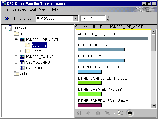
The graph reports represent the proportion of hits recorded for a particular table, column, or user relative to other hits in the same category. For example, the graph report for Columns Hit in Table X shows the relative proportion of hits received by each column in Table X. For each column, the name of the column, the number of hits, and the percentage of hits overall is displayed. The length of each bar represents the proportion of hits on the column relative to the hits on all the columns in the table.
Where there are two types of data represented in the table, you can choose which figures to represent in the graph format report. For example, the Total Table Hits report contains both the number and percentage of hits on each table, and the number and percentage of rows returned from each table. When you select the graph format for this report, a drop-down menu appears next to the View Graph icon at the bottom of the report area in the Tracker window. The menu gives you the option of viewing the Number of hits data or the Number of rows returned in graph format.
When viewing reports in graph format, you cannot perform the same customizations that you can perform when viewing reports in chart format. You cannot sort or apply filters to the data or customize the columns. If you perform any of these customizations in chart format and then switch to viewing the report in graph format, these customizations do not appear. If you return to viewing the report in chart format, the customizations reappear.
The find function is also only available when viewing a report in chart view.
The Sort, Filter, Customize Columns, Find icons are inactive when viewing reports in graph format.
Tracker allows you to view job history data so that you can tune the database for heavily used tables and columns. For a description of each report available in Tracker see Tracker Reports.
The Job Activity over Time report allows you to view job activity data in a detailed chart format or in a easy-to-read graph. When viewing this type of report in the detailed chart format, you may customize the report presentation as described in Customizing the Report Display.
An example of a graph view of a Job Activity over Time report is
illustrated below:
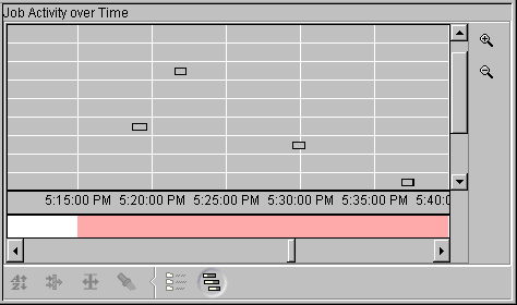
Individual jobs scheduled and completed during the specified time range are plotted in the grid area that makes up the greater part of the graph. Each row in the grid represents a job. To see all of the jobs scheduled during the time range, you may need to scroll down using the scroll bar control to the right of the grid area. Hover help provides you with the job ID associated with the row.
Additional job detail information, such as execution cost, the number of result rows, result set destination, and the SQL statement, can be viewed by double-clicking on a specific job row to open the Job Detail Information window.
The grid represents time from left to right. The time intervals are displayed along the bottom of the grid. The timing of each scheduled job is represented by a bar in the row associated with that job. The position and size of the bar tells you when the job was scheduled and how long it took to complete. For example, a job that began at 3:00 pm on February 15th and completed at 4:00 pm the same day is represented with a bar that spans the space between 3:00 and 4:00 on the time line.
The bar that represents a job may have a transparent portion and a solid portion. The transparent portion represents the time from when the job is scheduled to the time it actually runs. The solid portion represents the time that the query is actually executing.
Below the grid is a strip with shaded segments corresponding to the time intervals on the grid. The relative intensity of the shading in a segment represents the relative level of activity during that time interval: the darker the shade, the more jobs that were scheduled during that interval. The shading represents a relative measure: the interval associated with the greatest proportion of jobs will have the darkest shading. You can move your cursor over a particular segment of the strip to display the number of jobs scheduled in that interval.
When you first open a Job Activity over Time report to view in graph format, the graph displays the entire date range specified at the top of the Tracker window. This determines the size of the time intervals displayed on the graph. For example, if the specified date range spans 10 days, the time intervals shown at the bottom of the graph are one day. You can change the scale of the graph, increasing or decreasing the size of the time intervals by using the magnifying glass icons to the right of the graph. You can also use the Zoom In and Zoom Out items under View on the menu at the top of the application window.
To view a more detailed graph of the job activity for a smaller period of time, you can zoom in by clicking on the magnifying glass icon with the + sign in it or by double-clicking on the time interval and job activity level strips at the bottom of the graph. This will decrease the size of the time intervals on the graph, and provide a more detailed representation of job activity distribution. You can continue to decrease the size of the time intervals by clicking repeatedly on the icon. You can also use the menu bar at the top of the window to zoom in on a report by selecting View --> Zoom In. Double clicking on the time interval strip or the shaded job activity concentration strip will also allow you to zoom in.
Zooming in decreases the number of days displayed in the report. You may find that, as you zoom in closer, the job distribution spreads out and you need to use the horizontal scroll bar at the bottom of the graph to view all of the job activity for that time period.
When the graph is displaying hour time intervals, the dates are no longer visible at the bottom of the graph. To see the date represented in a particular view of the graph, move your cursor over the time interval in question. The date that is represented appears.
As you zoom in on a particular report, the time period represented in the graph decreases in size. However, the date range of the entire report remains the same, as shown at the top of the Tracker window.
If you wish to view a time period that is not shown when you zoom in closely on a report, you can adjust the date range for the report to reduce the scope of the report. For example, if you want to view the job activity during a particular day, you can change the date range (see Changing the Date and Time Range) to focus on that day.
To Zoom Out, click on the magnifying glass icon with the - sign in it. You can also use the menu bar at the top of the window to zoom out on a report by selecting View --> Zoom Out.
A date range exists for an entire Tracker session, which means that each new report opened during that session uses the same specified date range. Therefore, if you change the date range for a report, it resets the date range for the next report you open within the session.
When you open the Tracker tool, the default date range is set to one month, beginning one month before the session started and ending at the date and time the Tracker session started. The report that displays when you open the application reflects this default time range. To generate a set of reports covering a different time range, change the time range as described below.
If you change the time range in a Job Activity over Time report, the scale of the displayed data may also change. For example, if the date range is less than 30 days, the increments displayed in the Job Activity over Time report are days. If the date range is greater than a year, the increments displayed in the Job Activity over Time report are years. If the date range is 24 hours or less, the increments displayed in the Job Activity over Time report are hours. See Displaying Job History Data for information on the Job Activity over Time report display features.
There are two ways to change the date range for a session. You can either type over the existing date in the date field at the top of the Tracker window using the format MM/DD/YYYY, or you can use the drop-down calendar tool. To use this tool, perform the following steps:
| Note: | For new data to be available to display, iwm_tracker (the back-end process for Tracker) must have been run to analyze any job accounting data that accrued since its last run. |
To set the time boundaries for a Tracker session, you can either type over the existing time in the time field at the top of the Tracker window or you can use the up and down arrows next to the field as follows:
| Note: | The time is set according to a 24 hour clock. This means that 1:00 pm is represented as 13:00. |
| Note: | For new data to be available to display, iwm_tracker (the back-end process for Tracker) must have been run to analyze any job accounting data that accrued since its last run. |
To exit Tracker, select File --> Exit or click on the Close button in the upper right hand corner of the application window.